
Overview
Overview of TDataGridEh control
TDataGridEh can be used to display data from data sources such as TDataSet, TList, TList<T>.
In the current version of the EhLibFmx package, when connecting a grid to a source of type TList, TList<T>, the grid operates in the Read-Only mode.
Connecting the DataGridEh to a data list
The TDataGridEh is connected to the data list via the DataSource property of the TComponent type.
The TDataGridEh.DataSource property can be assigned components of the following types:
TDataSourcetype.TDataSettype.TDataSetTableLinkEhtype.TListTableLinkEhtype.TListTableLinkEh<T>type.
In the current version of the library, when connecting a data source of type TListTableLinkEh or TListTableLinkEh<T> to the grid, the grid can only work in ReadOnly mode.
To connect a grid column to a specific field of a table source, use the TColumnEh.FieldName property.
To connect a TDataGridEh to a dataset, set the DataSource property to an instance of the TDataSet or TDataSoursce class.
DataGridEh1.DataSource := MemTableEh1;Features of interaction between the DataGrid and the Data list.
When building a link between the grid and the data source, the grid creates an internal buffer object of the TXXXTableDataLinkEh type (TDataSetTableLinkEh, TListTableLinkEh, TListTableLinkEh\<T>) in which the values of the data source records are stored.
When viewing, sorting and filtering data in the grid, the data is sorted and filtered only in the array of the TBaseTableDataLinkEh class. There is no access to the TDataSet.Filter properties or other TDataSet properties. For this reason, the filtering and sorting algorithm does not depend on the TDataSet type.
If external methods change data in TDataSet, the buffer reloads all data from TDataSet.
Working with columns.
To create columns in design-time, double-click on the TDataGridEh component. The grid column editor will open. In the drop-down list, select the type of column you want to add. Click the Add button.
If the AutoGenerateColumns = True, the grid will automatically create dynamic columns based on the list of DataSet fields. In this case, the grid will create columns only for fields that are not in the list of static columns (columns created by the developer).
To configure properties for all grid columns, use the TDataGridEh.ColumnOptions property.
In the current version of EhLib the TDataGridEh have next types if columns:
TDataGridStringColumnEh– a universal data type for displaying text data, including numeric and DateTime.TDataGridCheckboxColumnEh– column for displaying checkboxes of the Checkbox type.TDataGridGraphicColumnEh– column for displaying images.TDataGridLayoutColumnEh– column for displaying cells with complex multi-element data.TDataGridComboboxColumnEh– column with combobox editor.
Row height
The height of rows in the grid is calculated based on the contents of the cells.
The default row height is taken from the height of the highest data cell for a record that does not contain data.
To have different heights for different records, set the HeightAutoExpand = True for the desired columns. In this case, the row height will be calculated individually for each grid record so that all are reduced in height in the cell. In this case, for columns of the TDataGridStringColumnEh type, it is more convenient to set WordWrap = True so that line wrapping works instead of cutting off at the cell border.
Setting the format and style of individual cells
To set the format and style of displaying individual cells, use the TDataGridEh.OnDataCellGetStyleParams and TColumnEh.OnDataCellGetStyleParams events.
In the following example, for grid rows in which the Continent field contains 'North America', the row cells will have a bold gray Font and a cell fills with Bisque color. In addition, the 'Name' field will have a Center alignment. In addition, the 'Capital' field will have a left Padding of 20 pixels:
procedure TfrCellFormating.DBGridEh1DataCellGetStyleParams(Sender: TObject;
  Params: TDataGridDataCellStyleParamsEh);
var
  ContValue: Variant;
begin
  ContValue := DBGridEh1ContinentColumn1.GetRowValue(Params.Row);
  if DBVarCompareValue(ContValue, 'North America') = TVariantRelationship.vrEqual then
  begin
    Params.Font.Style := Params.Font.Style + [TFontStyle.fsBold];
    Params.FontColor := TAlphaColorRec.Lightslategray;
    Params.Fill.Color := TAlphaColorRec.Bisque;
    if Params.Column.FieldName = 'Name' then
      Params.HorzAlign := TTextAlign.Center;
    if Params.Column.FieldName = 'Capital' then
      Params.Padding.Rect := TRectF.Create(20, 2, 2, 2);
  end;
end;
Sorting and filtering data in the grid
The grid performs all sorting and filtering operations in internal arrays. For this reason, you do not need to perform special algorithm tuning for sorting and filtering in different DataSets.
To enable sorting of data by clicking on the grid header, set the Fmx.TDataGridEh.Title.SortMarking.SortMarkable property to True. This property is set to True by default.
To enable data filtering via drop-down lists in grid headers, set the Fmx.TDataGridEh.Title.Filter.Enabled property to True. This property is set to True by default.
Accessing filtered records in the grid
If after filtering you want to run through the filtered records of the grid you need to use the TDataGridEh.Rows property.
Since the grid does not impose a filter on the DataSet, you cannot get a list of filtered data by accessing the DataSet records.
The following example populates the TMemo element with a list of countries from the visible (filtered) records of the grid. Before running this code you need to run the application and filter the records using the drop-down window for filtering data by any column:
procedure TForm1.Button1Click(Sender: TObject);
var
  I: Integer;
  Row: TDataGridRowEh;
  CountryNameCol: TBaseColumnEh;
  FieldValue: Variant;
begin
  Memo1.Lines.Clear;
  CountryNameCol := DataGridEh1.Columns.ColByFieldName('Name');
  for I := 0 to DataGridEh1.VisibleRows.Count - 1 do
  begin
    Row := DataGridEh1.VisibleRows[I];
    FieldValue := CountryNameCol.GetRowValue(Row);
    Memo1.Lines.Add(VarToStr(FieldValue));
  end;
end;
SearchPanel
SearchPanel is a special panel displayed above the column headers.
It provides input fields for entering text.
As you type, the grid automatically performs live searching: matching text is highlighted in the cells.
Additionally, you can filter the grid records so that only the rows containing the entered text are displayed.

To enable the SearchPanel, set TDataGridEh.SearchPanel.Enabled to True.
To make the data automatically filtered while typing, setTDataGridEh.SearchPanel.FilterOnTyping to True.
For a detailed description of the TDataGridEh.SearchPanel properties and events, see
TDataGridEh.SearchPanel
Complex titles

To create a complex title in the grid, you need to set the TDataGridEh.Title.IsComplexTitle property to True.
At design-time, double-clicking on the component opens the column editor. In this editor, you can create TDataGridSuperTitleEh components and move columns under the SuperTitle.
At run-time, you can create Columns and SuperTitle using the with operator and CreateWith constructor.
Below is the code that creates five columns and one SuperTitle. In this case, 3 columns are located under the SuperTitle:
Example:
procedure TFormDataGridEh.miComplexTitleClick(Sender: TObject);
begin
  if DataGridEh.Title.IsComplexTitle = True then Exit;

  DataGridEh.AutoGenerateColumns := False;

  DataGridEh.Title.IsComplexTitle := True;
  DataGridEh.Title.ComplexTitleTree.BeginUpdate;

  with TDataGridSuperTitleEh.CreateWith(Self, DataGridEh.Title) do
  begin
    Text := 'Super Title 1';
    with TDataGridStringColumnEh.CreateWith(Self, RefSelf) do
    begin
      FieldName := 'Name';
      Width := 120;
    end;
    with TDataGridStringColumnEh.CreateWith(Self, RefSelf) do
    begin
      FieldName := 'Capital';
      Width := 120;
    end;
    with TDataGridStringColumnEh.CreateWith(Self, RefSelf) do
    begin
      FieldName := 'Continent';
      Width := 120;
    end;
  end;

  with TDataGridStringColumnEh.CreateWith(Self, DataGridEh.Title) do
  begin
    FieldName := 'Area';
    Width := 100;
  end;

  with TDataGridStringColumnEh.CreateWith(Self, DataGridEh.Title) do
  begin
    FieldName := 'Population';
    Width := 100;
  end;

   DataGridEh.Title.ComplexTitleTree.EndUpdate;
end;
In the current version, the IsComplexTitle mode only works when AutoGenerateColumns = False.
Footers
To create a footer in the grid, use the TDataGridEh.Footer property.
Add the number of elements corresponding to the number of footer rows to the DataGridEh.Footer.Rows collection.
For the desired TBaseColumnEh column, add new elements to the Footers collection. When displaying data in the footer, an element from the Footers collection will be displayed in the corresponding entry in the Footer area of the grid.
For each element in TBaseColumnEh.Footers, set the TBaseColumnFooterEh.AggregateFunction property to set the summation function.
In the current version, the grid supports the following summation functionsTFooterAggregateFunction = (Non, Sum, Avg, Count, Min, Max, Custom);
Below is an example of how to create footers in the program code:
Example:
procedure TFormDataGridEh.MenuItem5Click(Sender: TObject);
var
  ColFooter: TBaseColumnFooterEh;
begin
  if DataGridEh.Footer.Rows.Count = 0 then
  begin
    DataGridEh.Footer.Rows.Add;
    ColFooter := DataGridEh.Columns.ColByFieldName('Population').Footers.Add;
    ColFooter.AggregateFunction := TFooterAggregateFunction.Sum;

    ColFooter := DataGridEh.Columns.ColByFieldName('Area').Footers.Add;
    ColFooter.AggregateFunction := TFooterAggregateFunction.Sum;
  end;
end;
Show TreeView structure
TDataGridEh allows to display a tree structure within grid cells.
It should be noted that the TDataGridEh itself cannot form a tree structure of records based on records in the data source, but the TDataGridEh can display the characteristics of a tree structure if the records in the data source have the corresponding properties.
For an example of displaying a tree structure, see the demo project EhLib.Fmx.MainDemo.dproj in the file SolutionFrame.TreeViewWithMemTableEh.pas and SolutionFrame.TreeViewWithTreeListEh.pas.
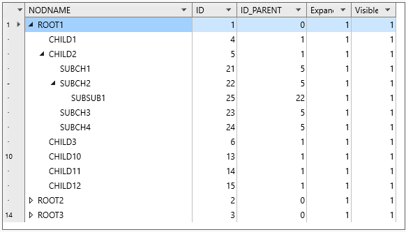
Displaying Tree Branch Indicators
To display the tree branch area in the grid, implement the TDataGridEh.OnGetDataTreeViewAreaParams event. In this event, populate the following tree branch parameters:
- Params.TreeAreaVisible: Determines if the tree branch area is visible in the cell.
- Params.Level: Specifies the branch level in the tree.
- Params.SignVisible: Indicates whether the Expanded/Collapsed icon is visible.
- Params.SignState: Specifies the expanded or collapsed state of the branch.
Below is the OnGetDataTreeViewAreaParams event handler for displaying the TMemTableEh tree structure when this component is configured to store records as a tree.
procedure TfrTreeViewWithMemTableEh.
  DataGridEh1GetDataTreeViewAreaParams(
    Sender: TObject;
    Params: TDataGridDataTreeViewAreaParamsEh);
var
  Bookmark: TBookmark;
  RecView: TMemRecViewEh;
begin
  if Params.Row = nil then Exit;
  if Params.Column.VisibleIndex > 0 then Exit;

  Bookmark := TDataSetRecLinkEh(Params.Row.SourceRowLink).DataBookmark;
  RecView := MemTableEh1.BookmarkToRecView(Bookmark);

  Params.TreeAreaVisible := True;
  Params.Level := RecView.NodeLevel - 1;
  Params.SignVisible := RecView.NodeHasChildren;
  if RecView.NodeExpanded then
    Params.SignState := TTreeSignStateEh.Expanded
  else
    Params.SignState := TTreeSignStateEh.Collapsed;
end;
Handling User Interaction
To make the grid respond to mouse clicks on the Expanded/Collapsed icon, implement the TDataGridEh.OnSetDataTreeSignState event handler.
In the following event handler,
- Modify the
NodeExpandedproperty for the record inTMemTableEh. TMemTableEhautomatically notifies theTDataLinkof changes to the visible data list, and the grid redraws the visible records accordingly.
procedure TfrTreeViewWithMemTableEh.
  DataGridEh1SetDataTreeSignState(
    Sender: TObject;
    Params: TDataGridSetDataTreeSignStateParamsEh);
var
  Bookmark: TBookmark;
  RecView: TMemRecViewEh;
begin
  if Params.Row = nil then Exit;
  if Params.Column.VisibleIndex > 0 then Exit;

  Bookmark := TDataSetRecLinkEh(Params.Row.SourceRowLink).DataBookmark;
  RecView := MemTableEh1.BookmarkToRecView(Bookmark);

  if Params.SignState = TTreeSignStateEh.Expanded then
    RecView.NodeExpanded := True
  else
    RecView.NodeExpanded := False;
end;
Show record without separating it into cells
TDataGridEh have capabilities of displaying records in a grid without splitting them into cells. This approach is useful for displaying group header records created in the data source. While the current version of TDataGridEh does not support record grouping, it can display records that represent group headers from the data source without splitting them into cells.

To specify how a record is displayed, use the OnGetDataRowSplitWay event. To display the content of records in the TDataGridRowSplitWayEh.NoSplit mode, assign a CellManager of type TDataGridDataRowBandManagerEh in the OnGetDataRowManager event.
In next event handler the record splitting type is determined based on the class type in the data source
procedure TfrSolutionRowAsWhole.
  DataGridEh1GetDataRowSplitWay(
    Sender: TObject;
    Params: TDataGridGetDataRowSplitWayParamsEh);
var
  SourceListItem: TObject;
begin
  if Params.Row = nil then Exit;

  SourceListItem := Params.Row.SourceObjectItem;
  if SourceListItem is TListGroupCaption then
    Params.RowSplitWay := TDataGridRowSplitWayEh.NoSplit
  else
    Params.RowSplitWay := Params.DefaultGetRowSplitWay();
end;
Highlight Url In Grid Cells and Format Text Sections
TDataGridEh has the ability to highlight URL links in cell text and format arbitrary sections of text within a cell.
Highlighting URL Links
To highlight sections of text in cells containing URL links:
- Set the
TDataGridStringColumnEh.HighlightHyperlinksproperty toTrue. - To handle mouse clicks on highlighted sections, implement the
OnDataCellInTextLinkClickevent handler.

Custom Text Formatting
To apply custom formatting to specific sections of text in a data cell:
- Implement the
OnDataCellGetStyleParamsevent. - In this event, populate the
FormattedRangeslist, where each element is of typeTLaFormattedTextRangeEhand contains the following properties:Font: TFont– The font for the text section.ParentFont: Boolean– Use the default font.TextPos: Integer– The starting position of the formatted section.TextLength: Integer– The length of the formatted section.FontColor: TAlphaColor– The background color.IsHyperLink: Boolean– Indicates if the section is a hyperlink, triggering theOnDataCellInTextLinkClickevent on mouse click.Tag: NativeInt– Additional information for the text section.
The following is an example of the OnDataCellGetStyleParams event handler, which sets the font for the first letter of the text in all cells of a column.
procedure TfrHighlightingLinksFormatTextSections.
  DataGridStringColumnEh2DataCellGetStyleParams(
    Sender: TObject;
    Params: TDataGridStringDataCellStyleParamsEh);
var
  FormattedRange: TLaFormattedTextRangeEh;
begin
  FormattedRange := TLaFormattedTextRangeEh.Create;
  FormattedRange.TextPos := 0;
  FormattedRange.TextLength := 1;
  FormattedRange.IsHyperLink := True;
  FormattedRange.Font := CapitalCharFont;
  FormattedRange.FontColor := TAlphaColorRec.Brown;
  Params.FormattedRanges.Add(FormattedRange);
end;
For an example of Text Section Formatting, see the demo project EhLib.Fmx.MainDemo.dproj in the file SolutionFrame.HighlightingLinksFormatTextSections.pas.
LaObject principles.
LaObject principles are a model of visual objects arrangement on a form when the object position is defined not by Left, Top coordinates, but by the Child elements arrangement algorithm in a Parent object. For example, the CtackPanel Parent object arranges Child elements one after another from left to right or from top to bottom. The size of the elements is determined by the size of the Child elements or by the VertAlignment and HorzAlignment properties. For example, HorzAlignment = Stretch stretches the Child element inside the Parent object from the left to the right border of the Parent object. The Margins and Padding properties affect the margins from the edges and from the internal elements.
The contents of all cells in TDataGridEh are displayed through instances of LaObject classes. Using the properties and events of TDataGridEh, you can fill the contents of the grid cells with a complex tree-like set of LaObjects.